programme discovery experience
The Annual meeting held by the Forum has nearly 400 sessions. The participants have to go through this information and build their personal agendas for the meeting. With only a few simple filters to aid this process, the experience was very inefficient. My role was to create a ‘discovery experience’ for building these agendas and enhance the ‘agenda management’ feature. I worked with several internal stakeholders for the conceptualisation before working on the design and implementation of the feature.

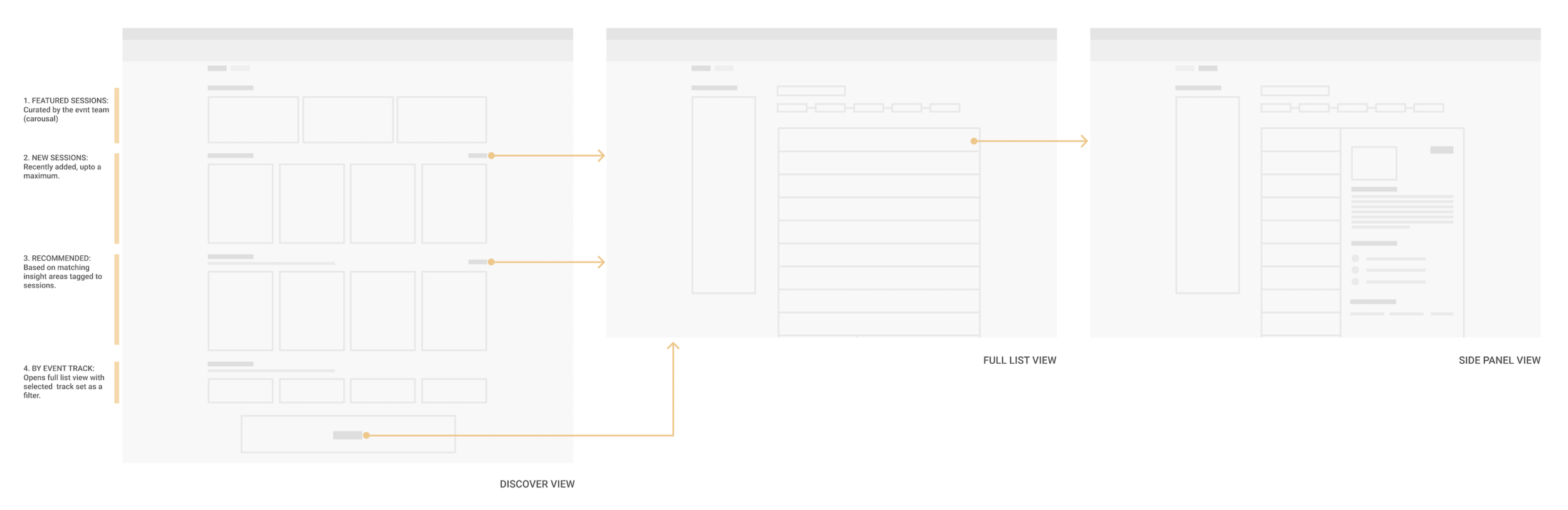
I started by working with the teams responsible for the content. Working closely with them. I was able to understand their vision for the outcome. The aim was to create a visual and dynamic experience which motivated content exploration by the user. The scope of the design involved three key pages in any event.
Programme: discover
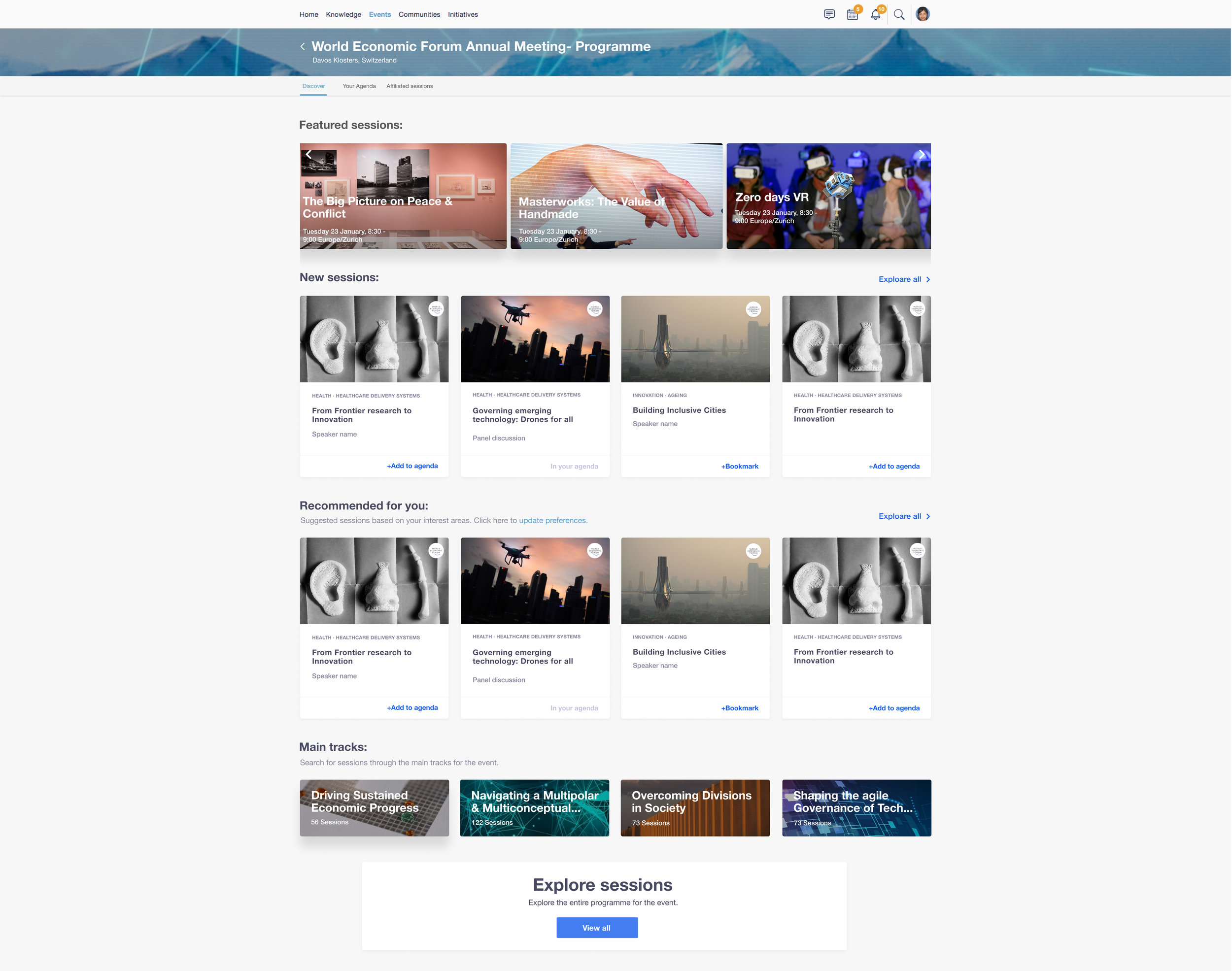
The final design consisted of a ‘discover’ tab as the landing page for the event programme. This consisted of several sections to be co-curated by the internal teams. Based on previous user behaviour we broke the content into dynamic sections like ‘featured’ (by the Forum team), ‘newly added sessions’, ‘recommended’ (based on user preferences) and by programme tracks. The primary aim for this page was to engage the user and nudge them to explore the full programme.
Programme: list view
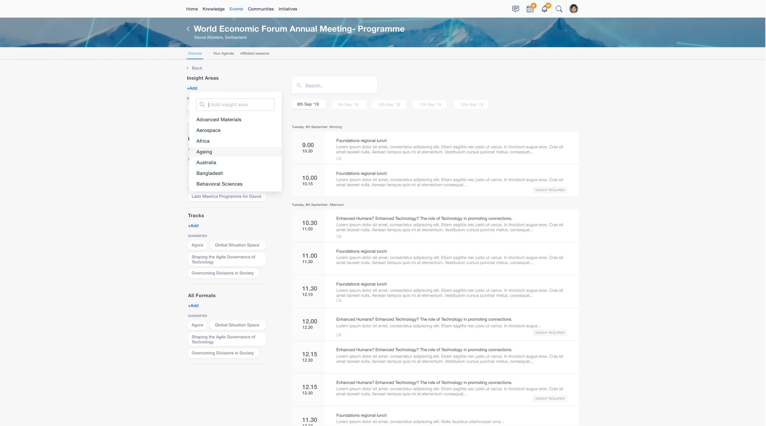
On the full view of the programme itself, we updated the filters so that the user can find relevant content quickly. A quick date shortcut was also added.
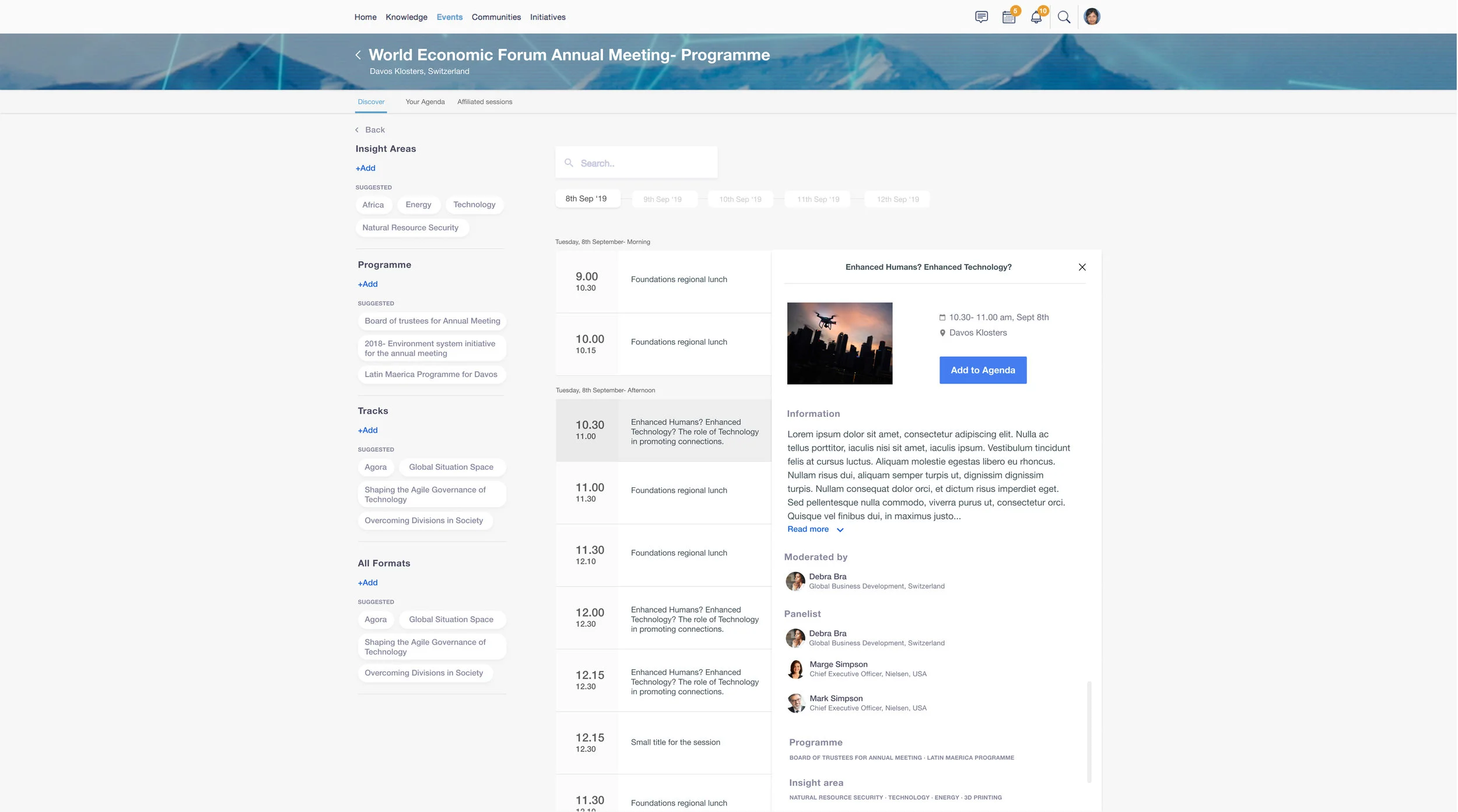
The full view of the programme also had a side panel on every line item for quick access to more information on a given session.
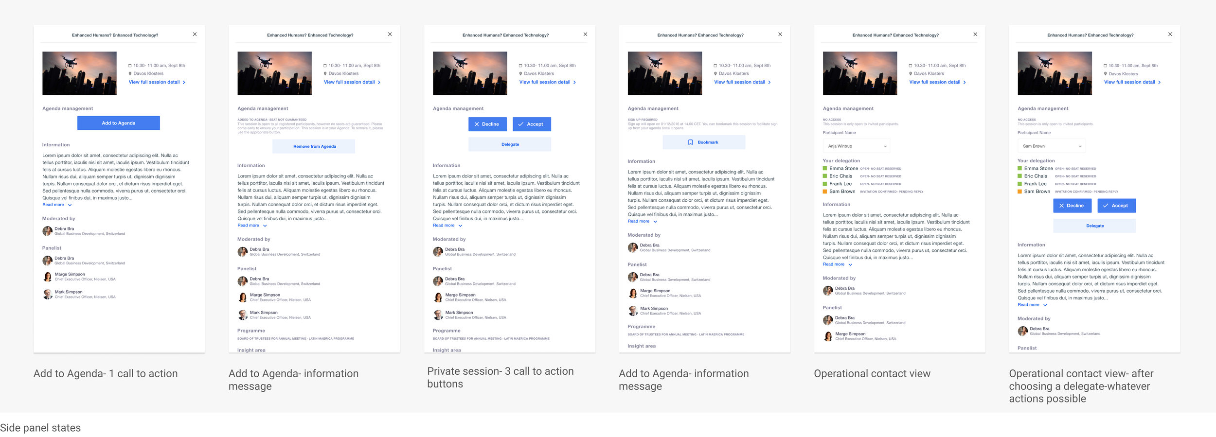
Programme: YOUR agenda
Once a participant added sessions to their personal agenda, they had to manage their signups from there. From a user perspective, the colour coding was essential to help the users know where they needed to take an action. The updated design tried to highlight this colour coding.

User validation and feedback
To gather some feedback regarding the improved color coding for agenda management, I adopted a slightly different approach. We asked our users a set of task based questions to see if the information displayed made sense to them. Apart from validating that the information was clear enough for the users to perform their tasks, we gained valuable insights regarding the process of managing this task from their perspective.