A tool to simplify and streamline the reporting process for multiple teams while reducing human error.
Client: Adobe Systems, India
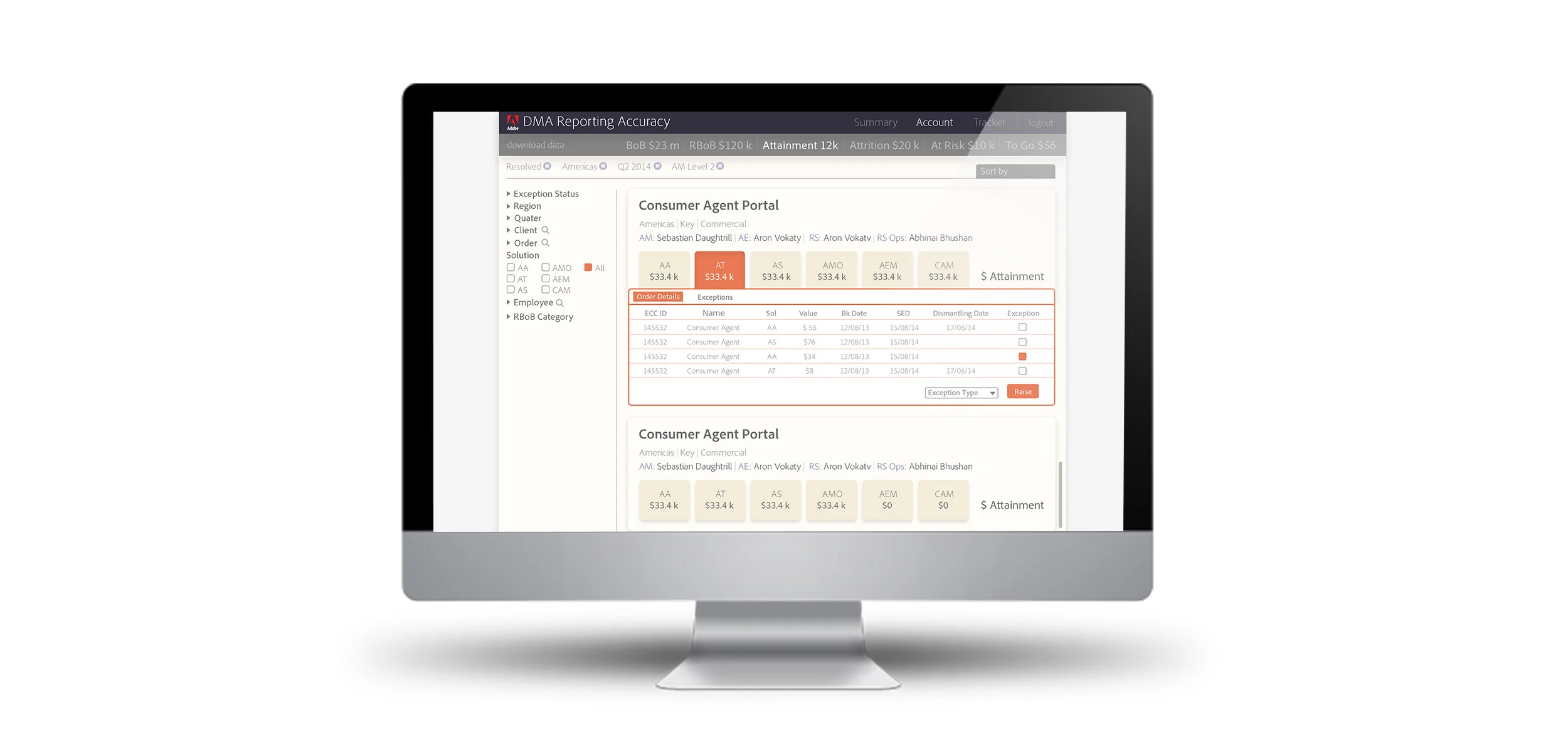
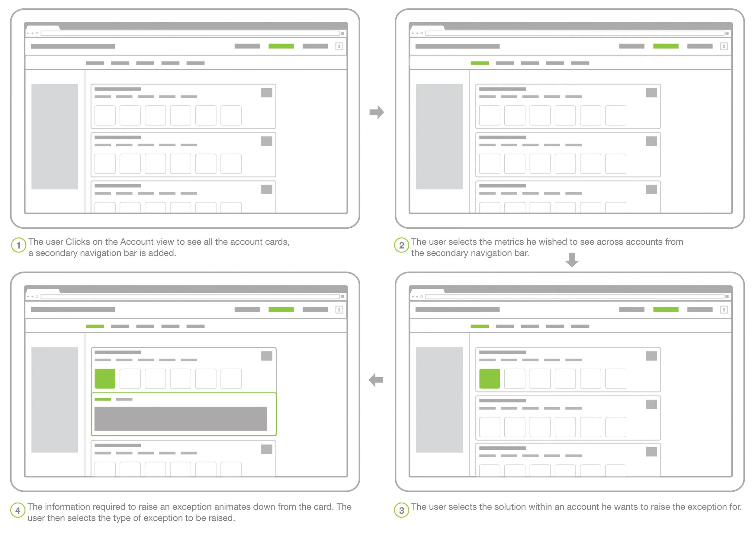
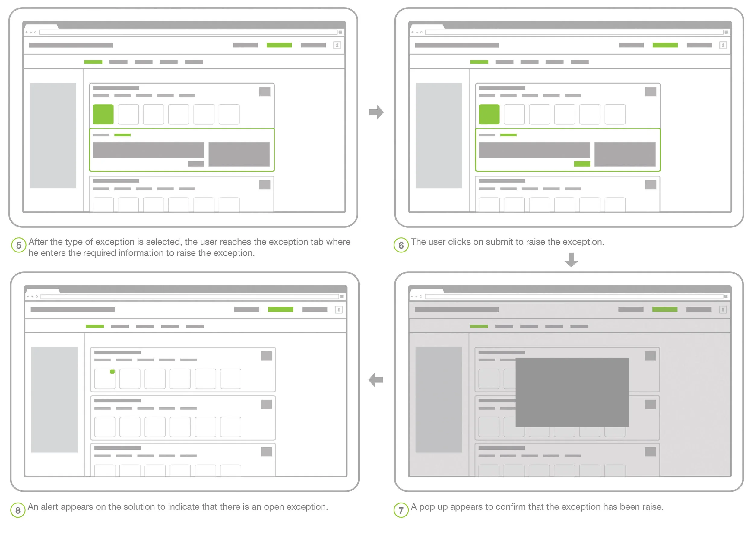
The Reporting Accuracy tool was created to make reporting more accurate. We created a web-based application to: streamline the process of raising these exceptions, provide all the necessary information, visibility to the exceptions raised and a workflow to resolve them (for the other team), all within the application.
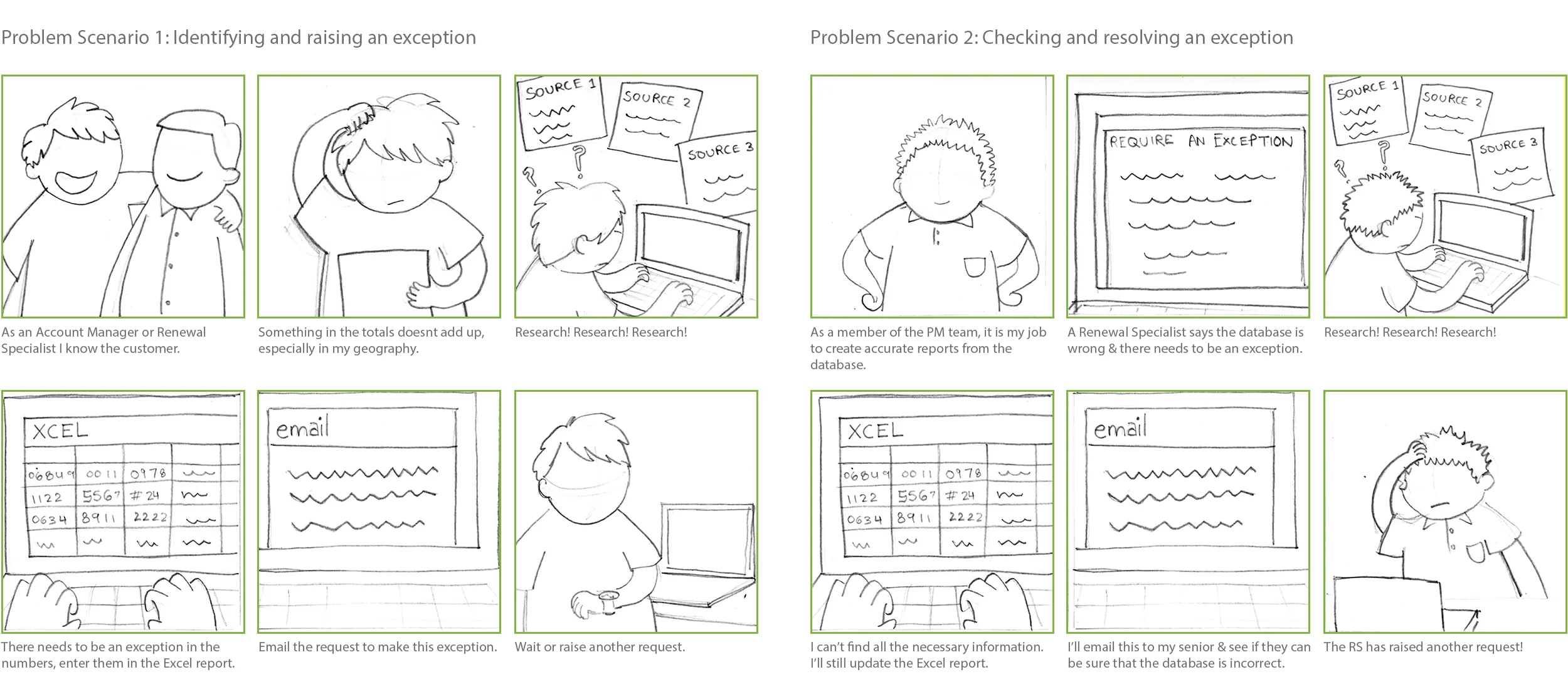
Sometimes a renewal specialist would find that the numbers (projected or actuals) did not seem correct from the database. The reason for this could be traced to the account level information. To rectify this, he had to raise an exception for the corresponding sales within the account, which was sent to another team.
All this was done via an excel report which not only led to confusion and human error but also caused a lot of inconvenience to the person raising or rectifying it.
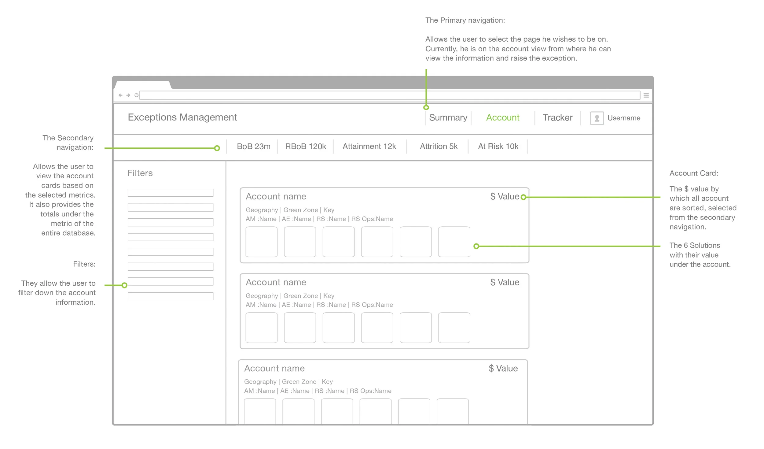
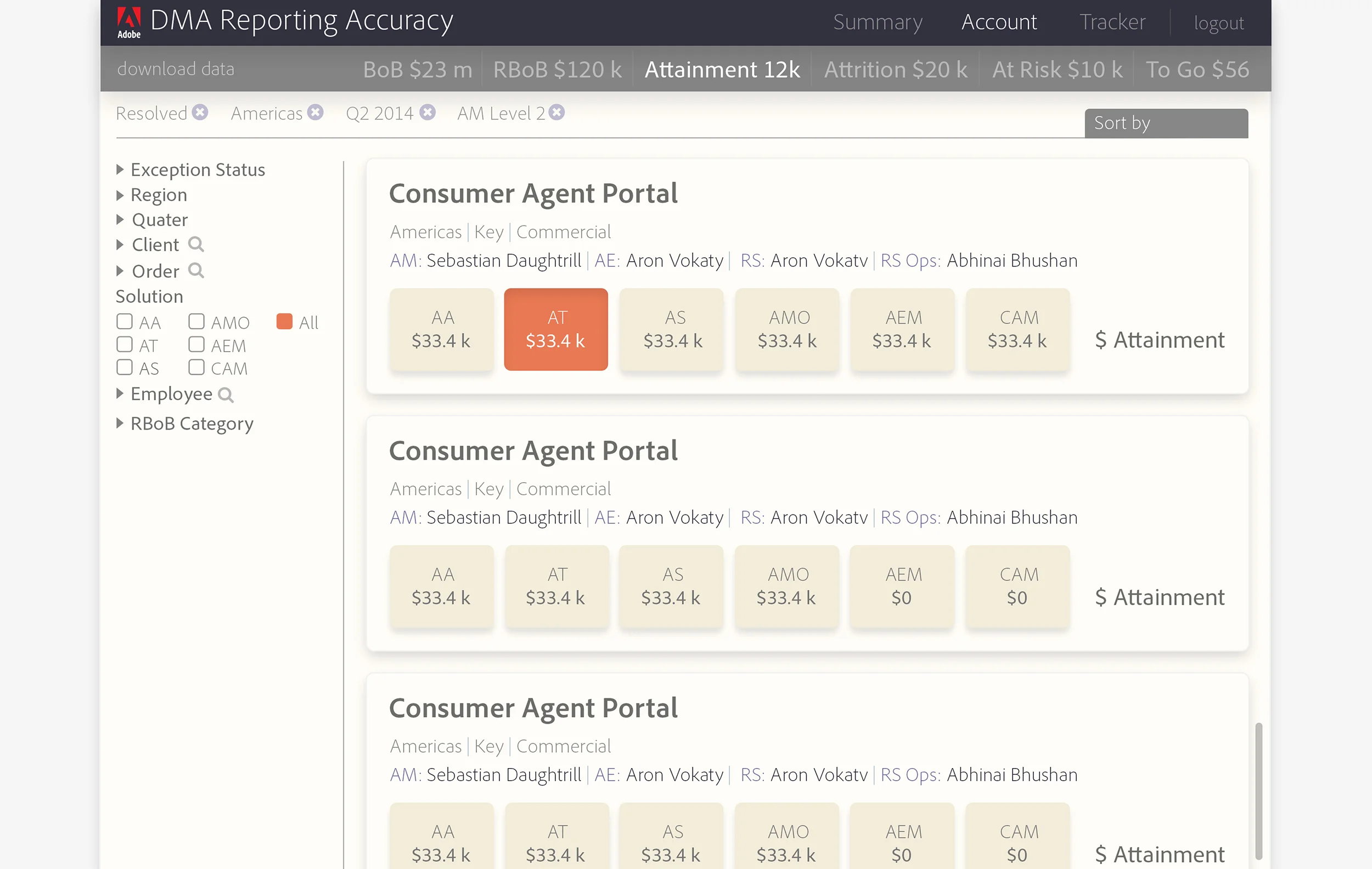
Wireframe structure of the "Account View"
Final visual design of the "Account View"
As a UX designer for Photoshop Elements (PSE). I worked on several product features. Depending on their stage of implementation in the product cycle, I worked on initial ideas to final implementation.
Some key features I worked on:
• Refine edge tool
• E-live search
• Ask Bob
• Elements welcome experience
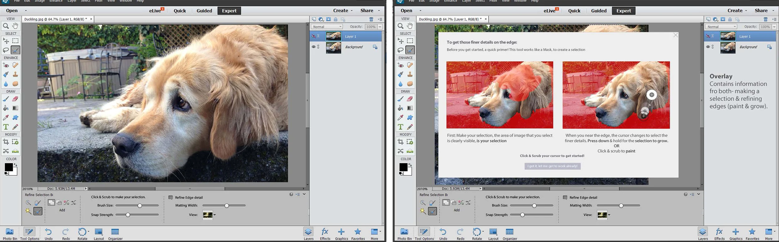
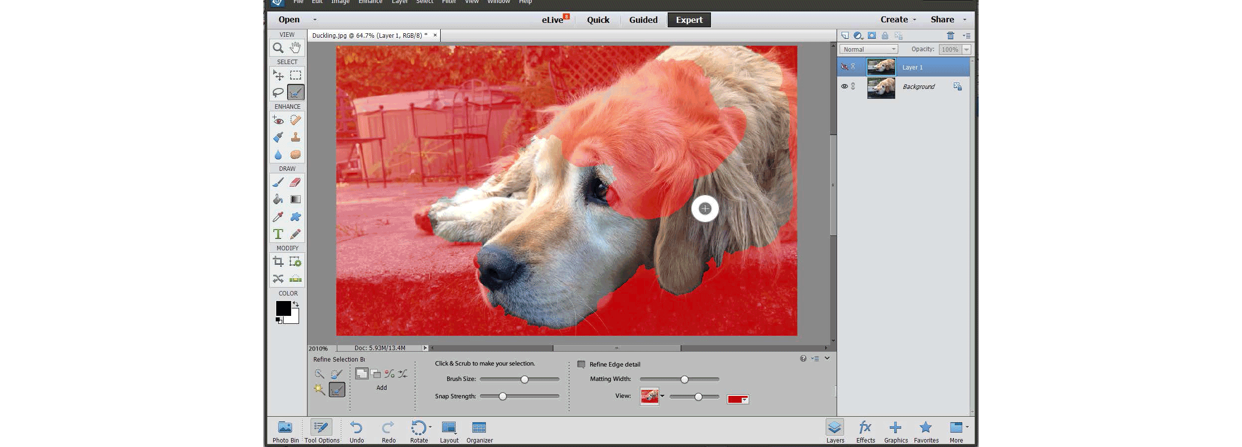
While adding a new feature (an advanced brush tip for refining edges) to a software with existing users, it became very important to explain the feature in a way that communicated the advantage, where it can be used & also how it can be used seamlessly. Such an overlay would only appear on first launch after an update.
The interface of this new feature was extremely simple and smart. The tool recognized edges with finer details that required the refine edge tool & the cursor changed automatically in such a region. (Above, the workflow)
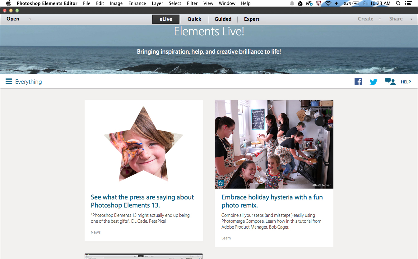
The elements live (eLive) section is a very unique segment of the elements suite as it directly understands the users and helps them make better use of the products.
The users of the elements suite are generally hobbyists and enthusiasts and eLive provides them with inspiration and tutorials to explore and gain more from the products.
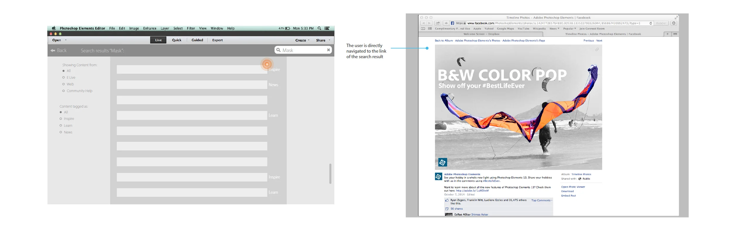
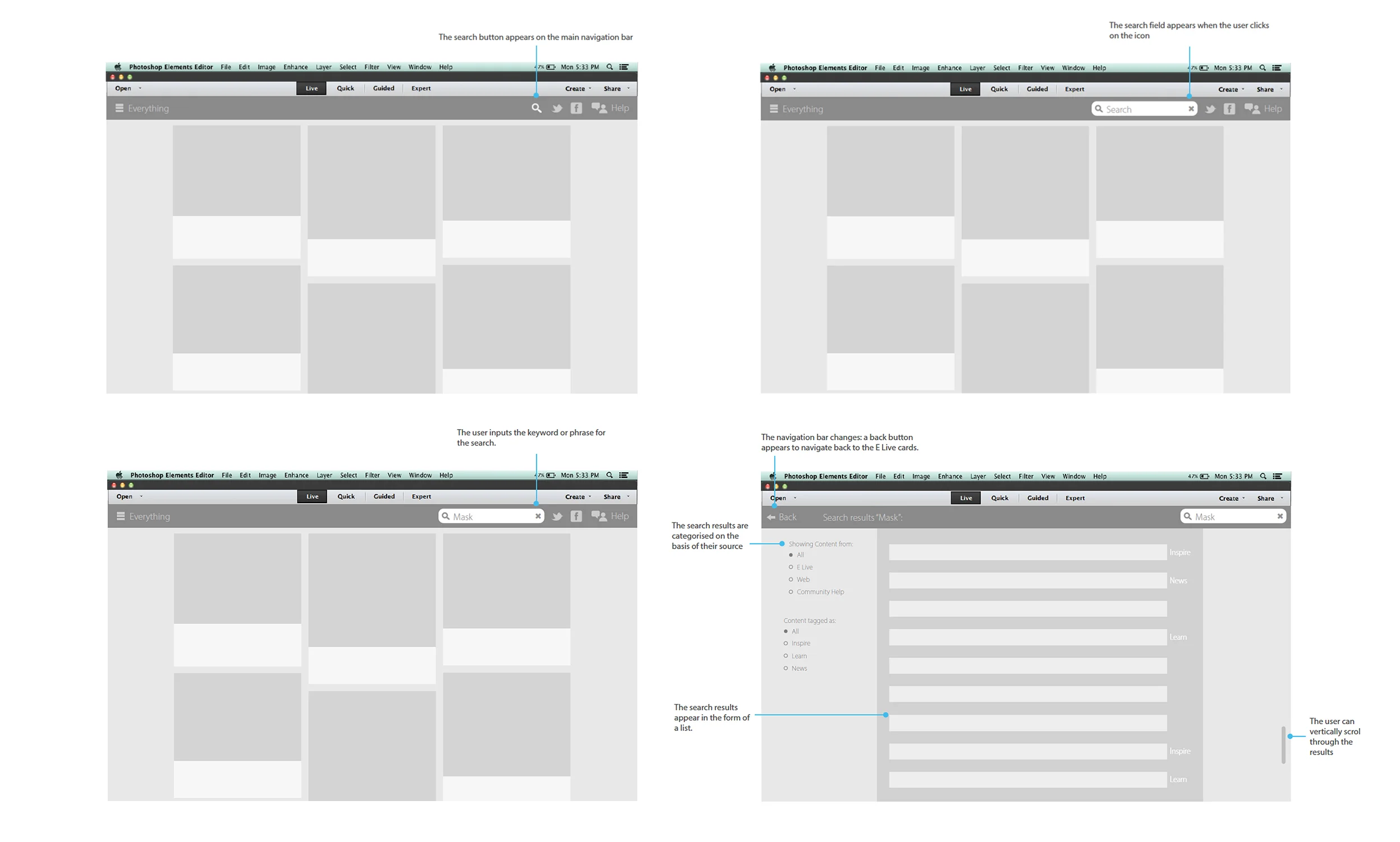
Being a relatively newer product suite, this knowledge was often spread to different forums- web, community & eLive cards. The challenge was to streamline all this into a simple yet comprehensive touch point for the users.
After several design iterations a result screen was selected which gave visibility to all the sources (website, community forums etc.) and helped users choose what kind of content they wish to see (inspire, tutorial etc.).
We decided to introduce a simple search feature to address this problem. Above, the basic workflow.
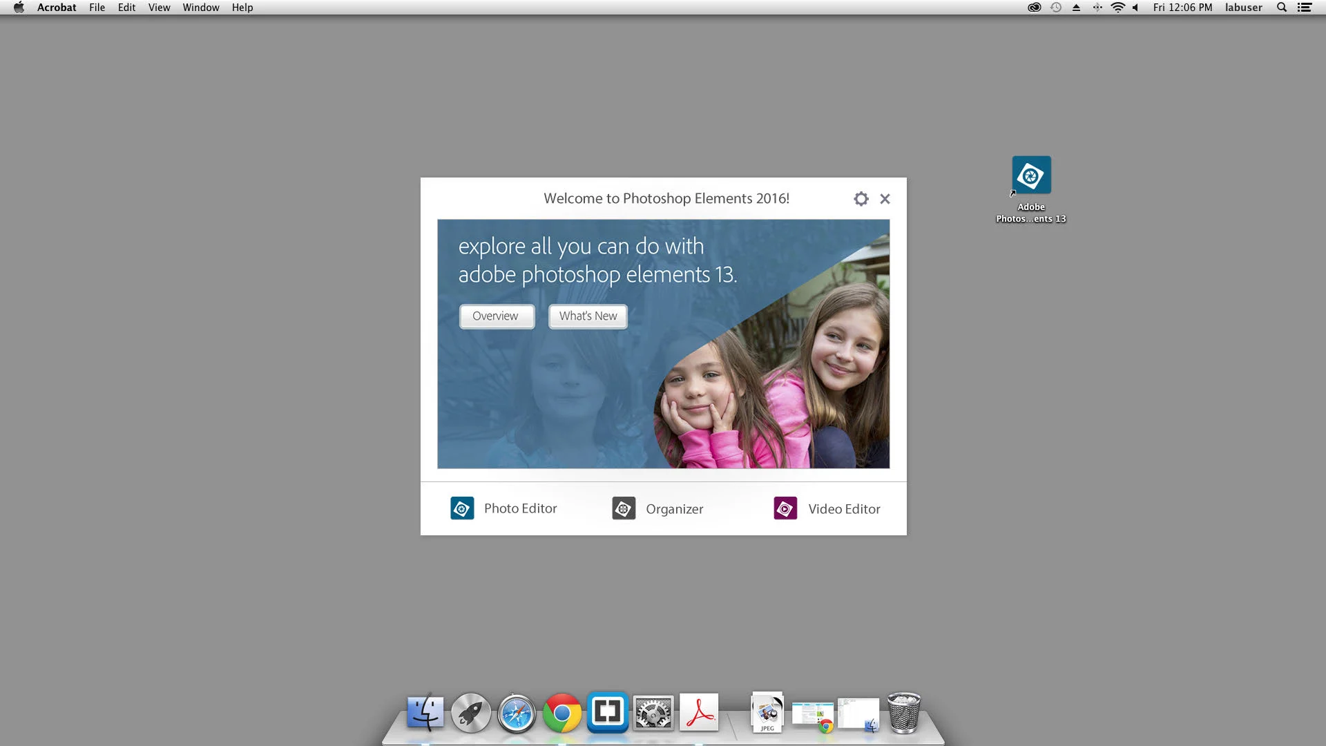
A new welcome screen design to integrate the elements suite.
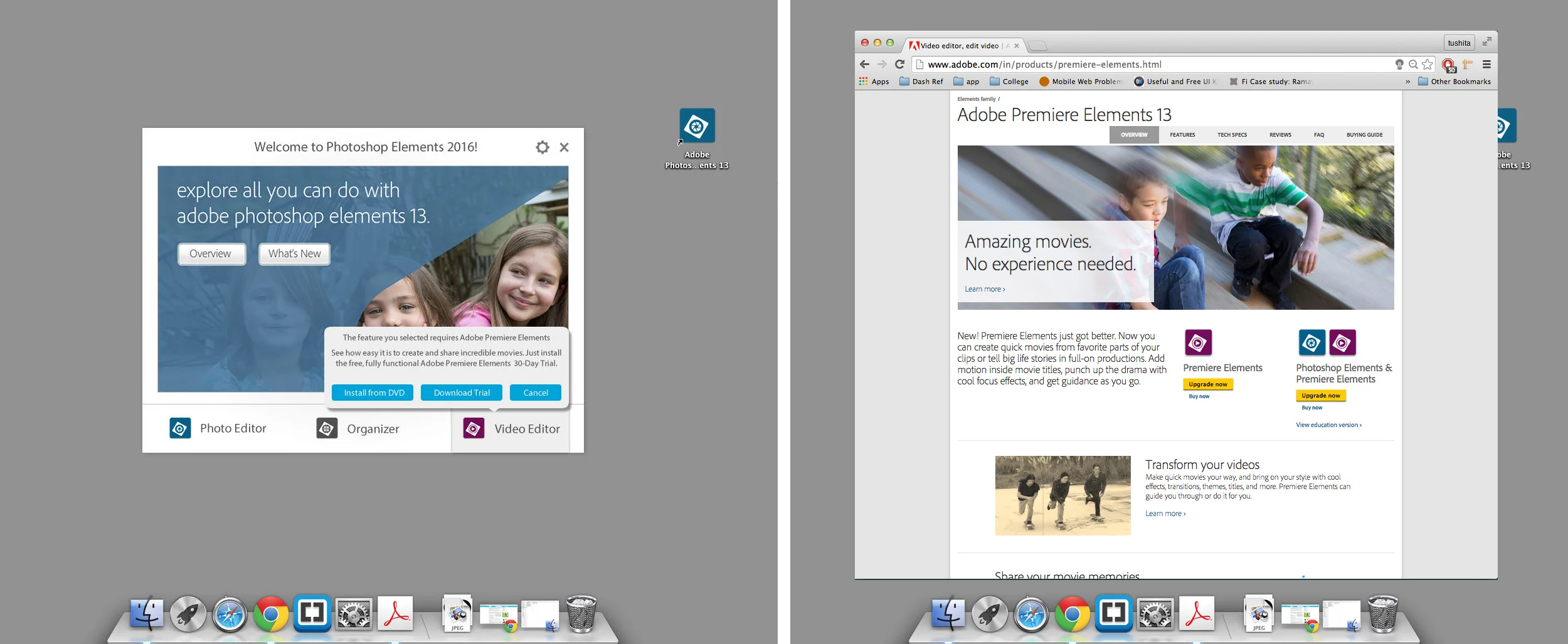
The elements suite consists of three products - Photoshop elements (PSE), Premiere elements (PRE) & Organizer. While PSE & PRE had a joint welcome experience, Organizer had a separate one.
This reduced the cohesiveness across the suite and often caused a bit of confusion for the users. I worked towards creating a combined workflow. This not only provided better integration but also formed the starting point of a unified identity of the suite.
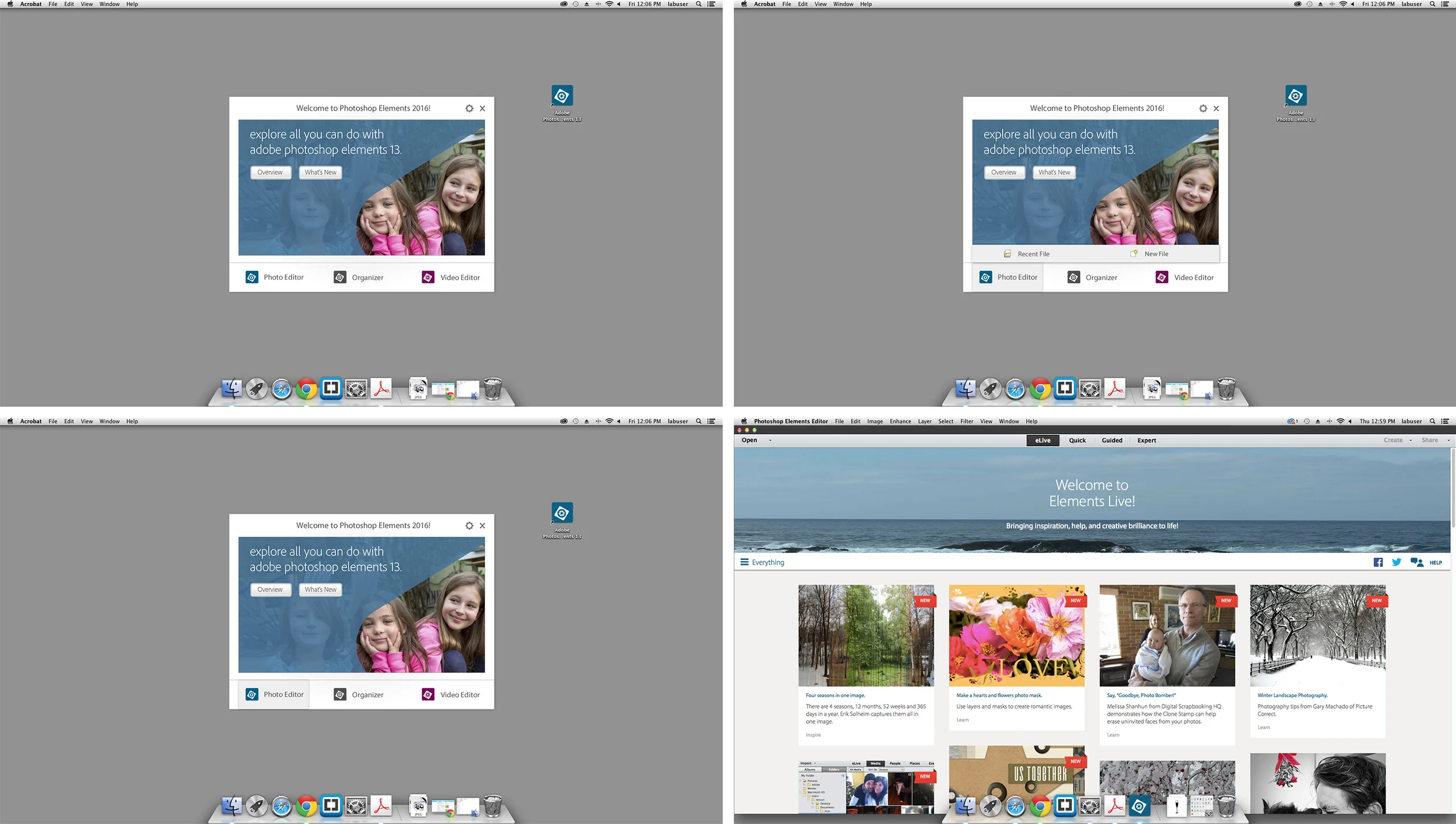
The new welcome pod.
One concern with merging the different product welcome experiences was ensuring that none of the individual workflows changed too much and yet seem homogenized enough. Here are the different launch states for Photoshop elements, for old and first time users.
The new welcome screen allowed for better opportunities to cross-sell other products from the suite.
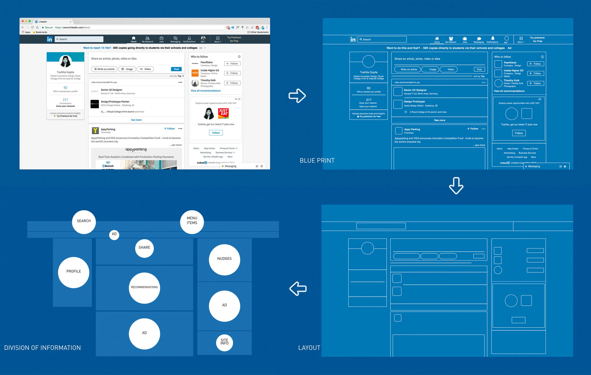
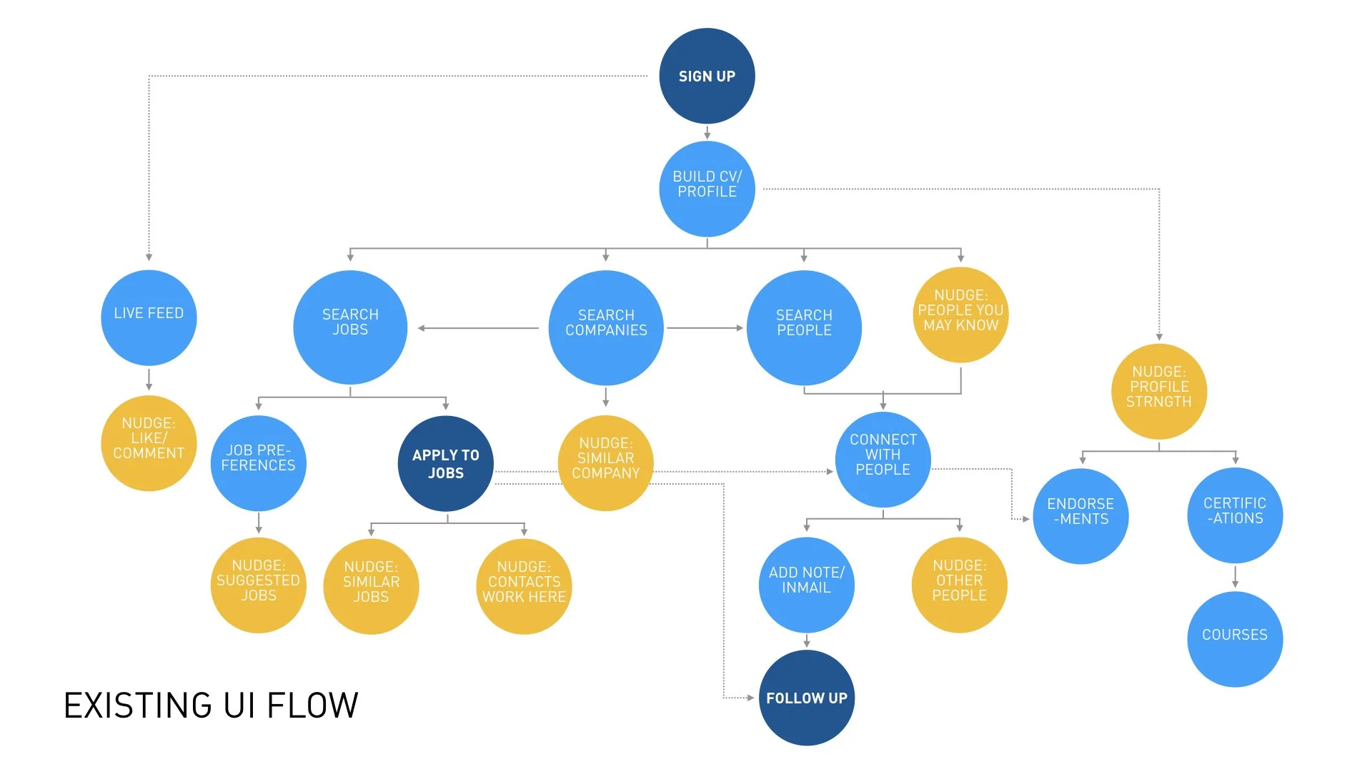
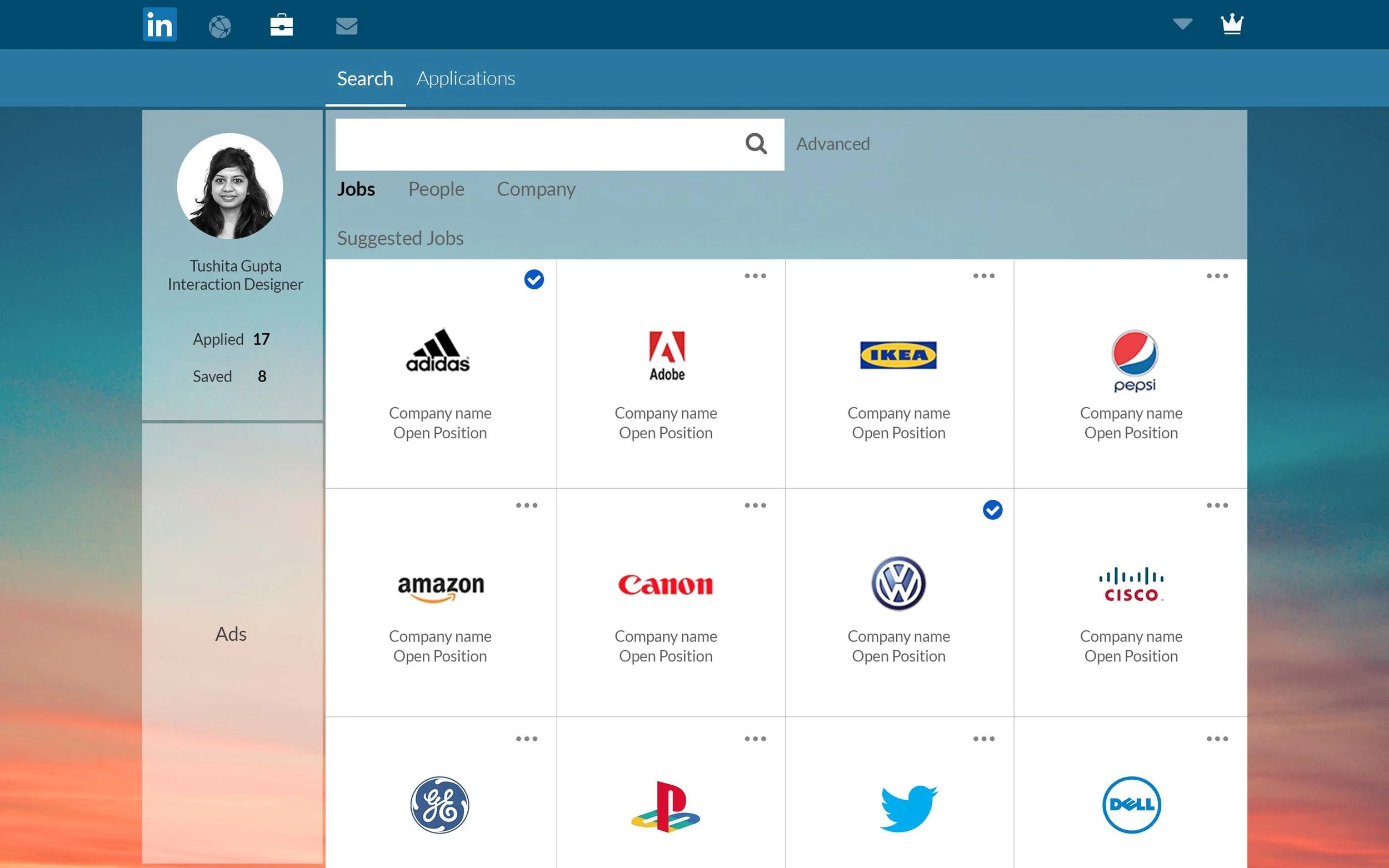
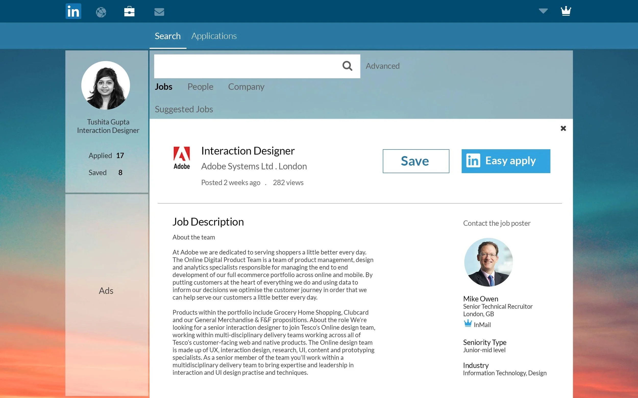
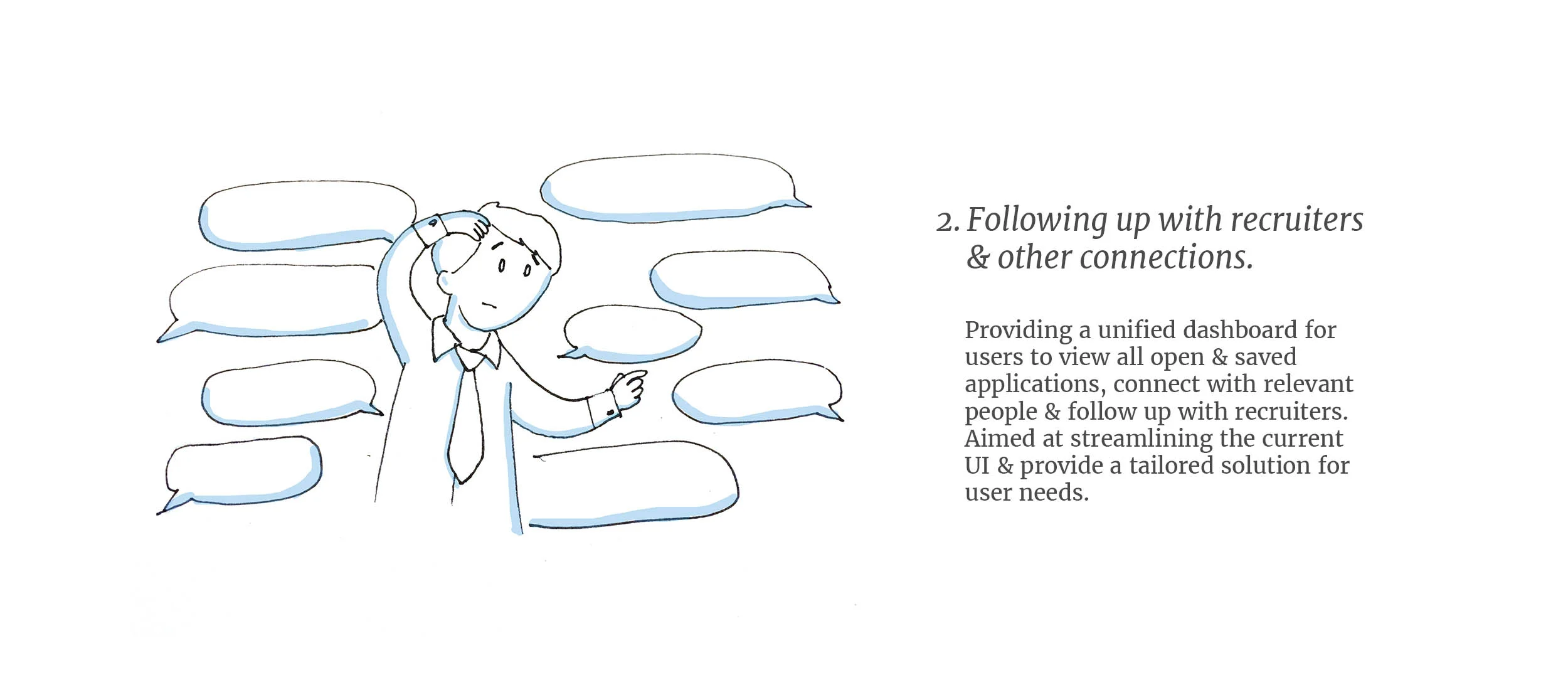
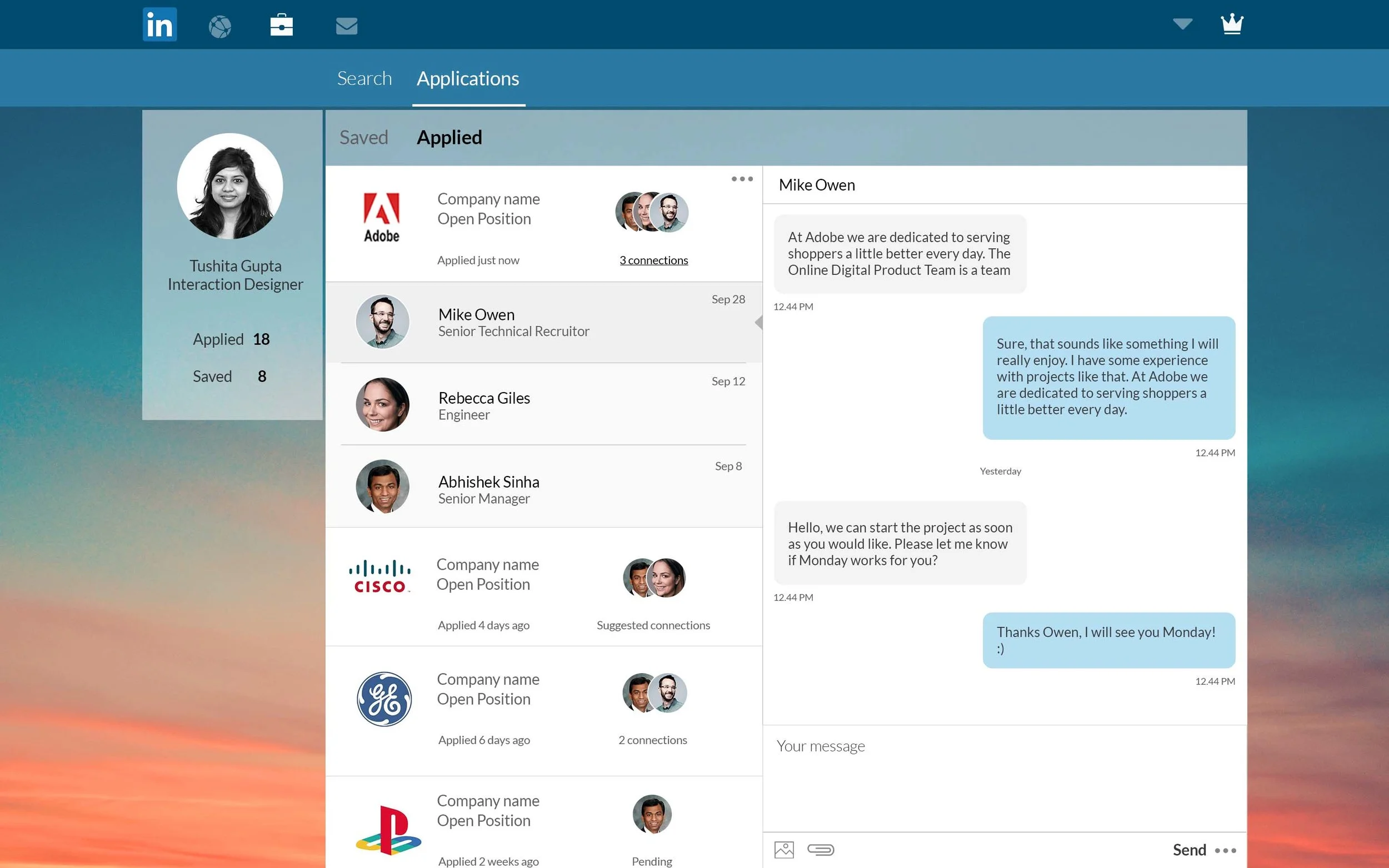
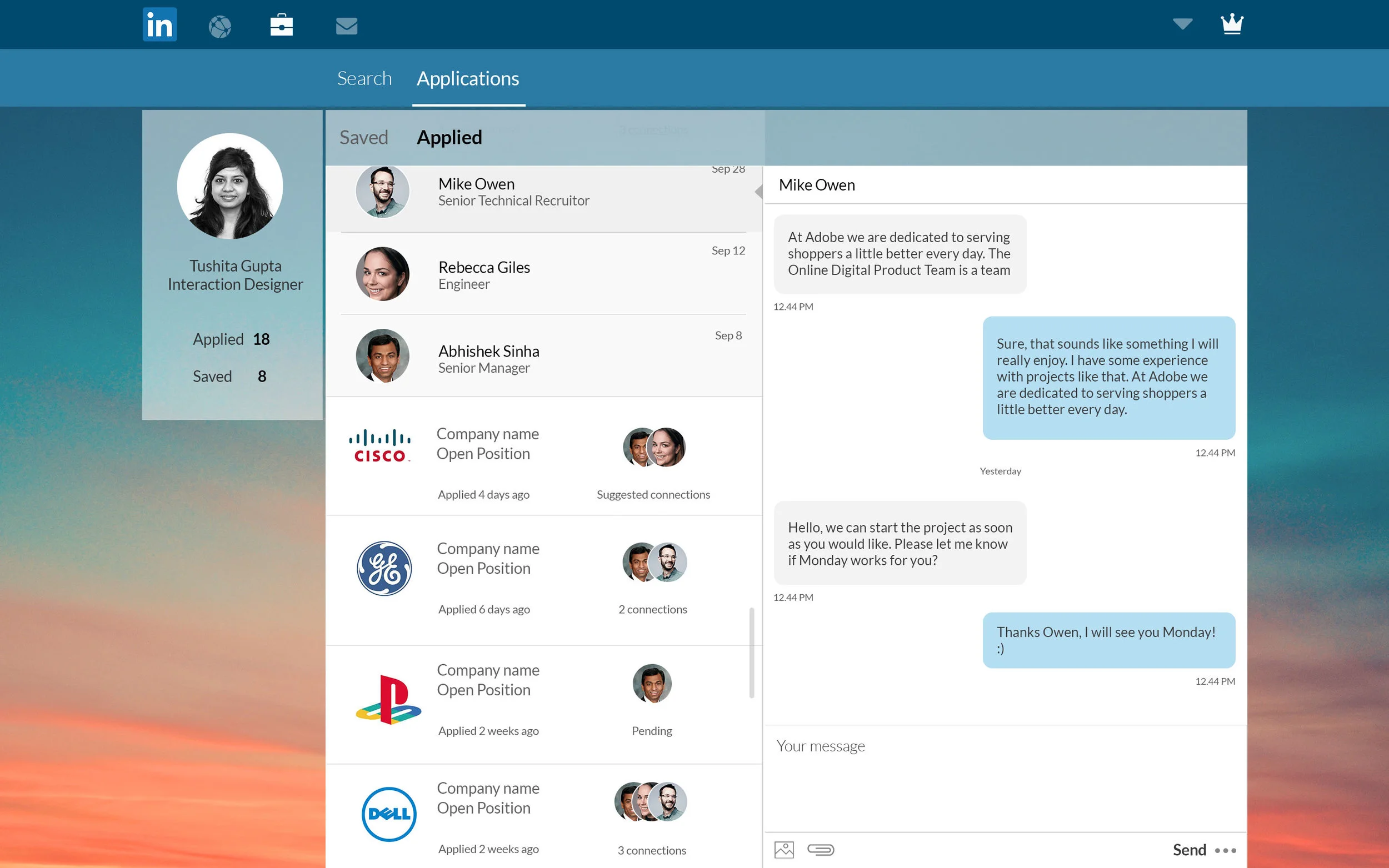
Drawing from my personal experience, I did a quick study to try and see how to improve the user experience of Linkedin- everyone's favourite job search companion!
Concept project
I started with a quick analysis to understand the existing interface better.
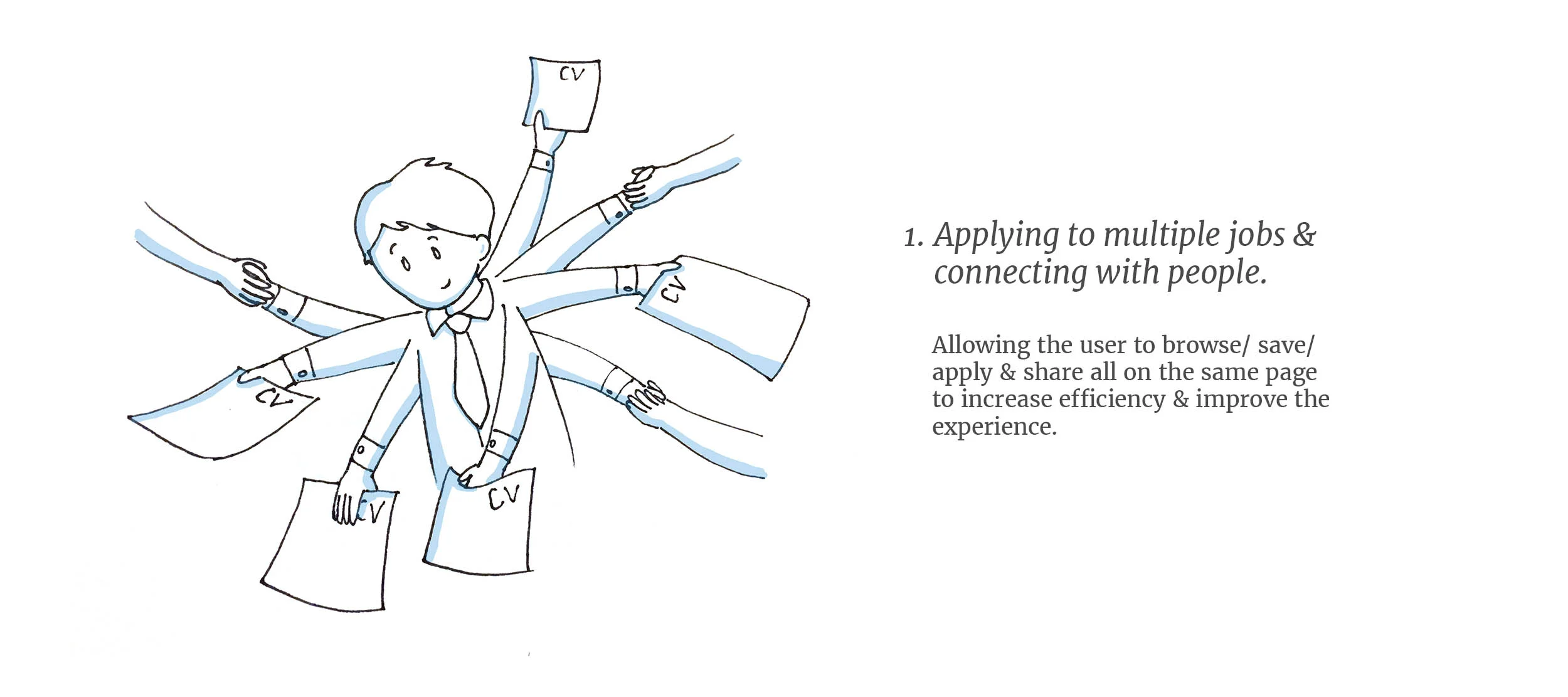
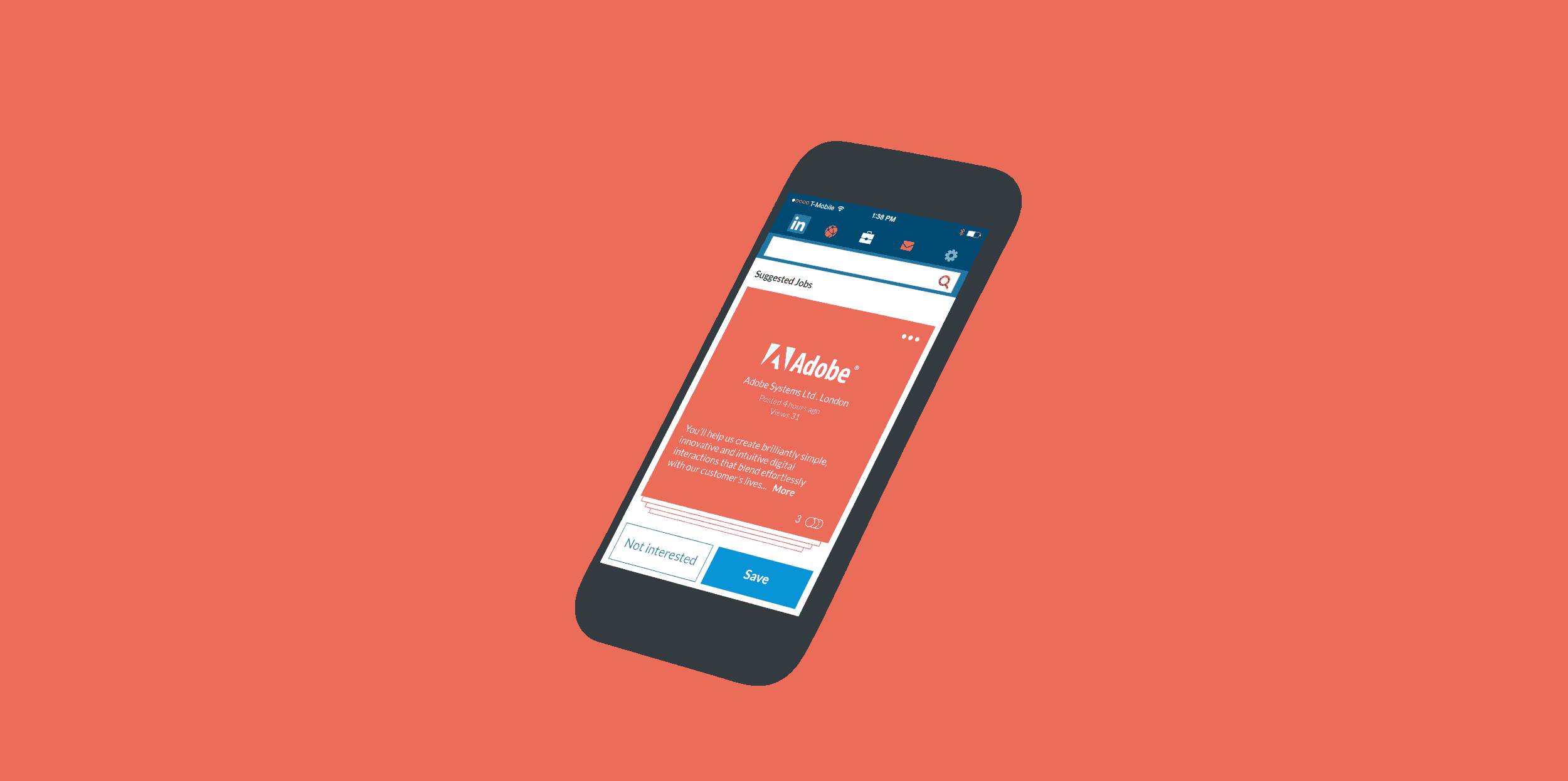
A quick glimpse of how mobile gestures could be utilized to further enhance the user experience to browse through jobs. A simple right swipe would save a job posting and the user can finish the application at their convenience.
A visual-mnemonic tool to help learn a new language and discover stories from a new culture.
When in a new country, can a new language act as a barrier that prevents people from discovering a whole new culture?
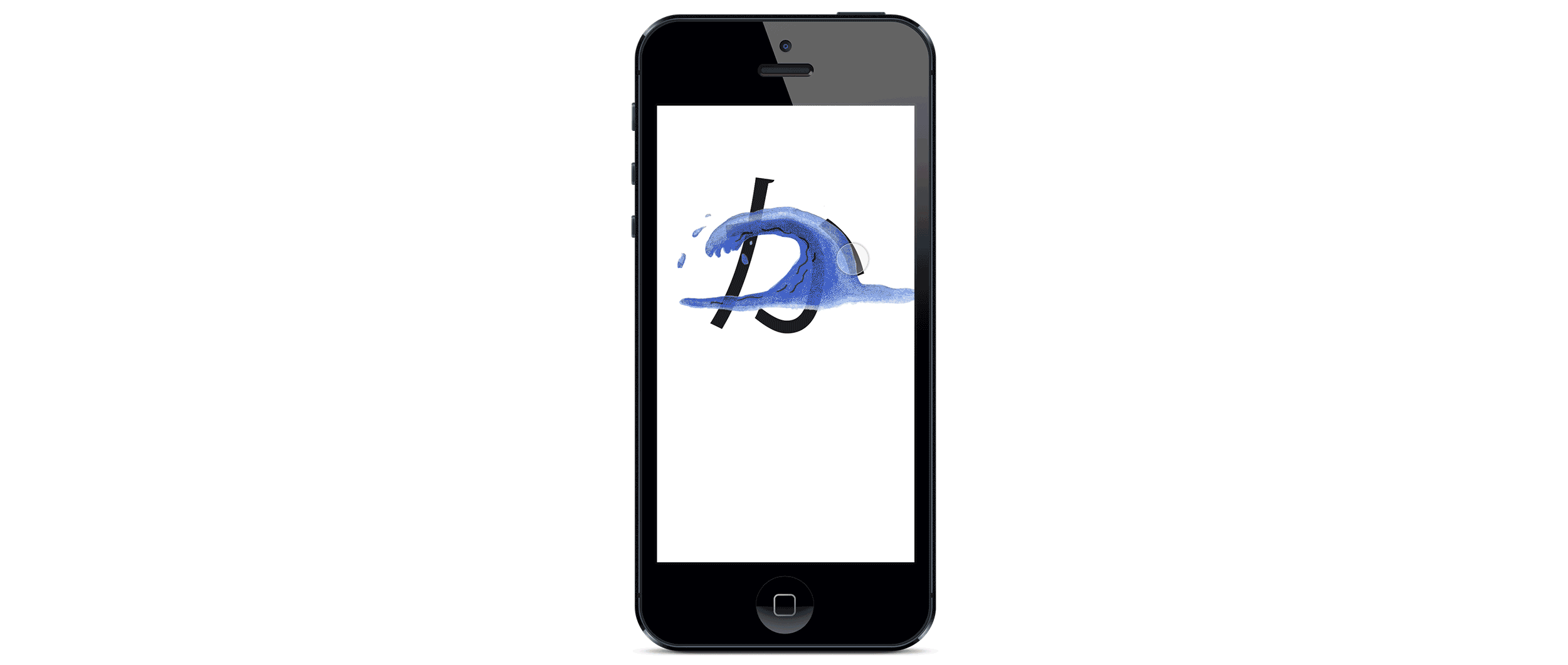
The Japanese language comprises of three separate scripts which from an outsider’s view just look like a set of unidentifiable symbols and shapes. I wondered if this could work as an opportunity to create a solution that helped the user learn a new language visually and understand the culture better by doing so.
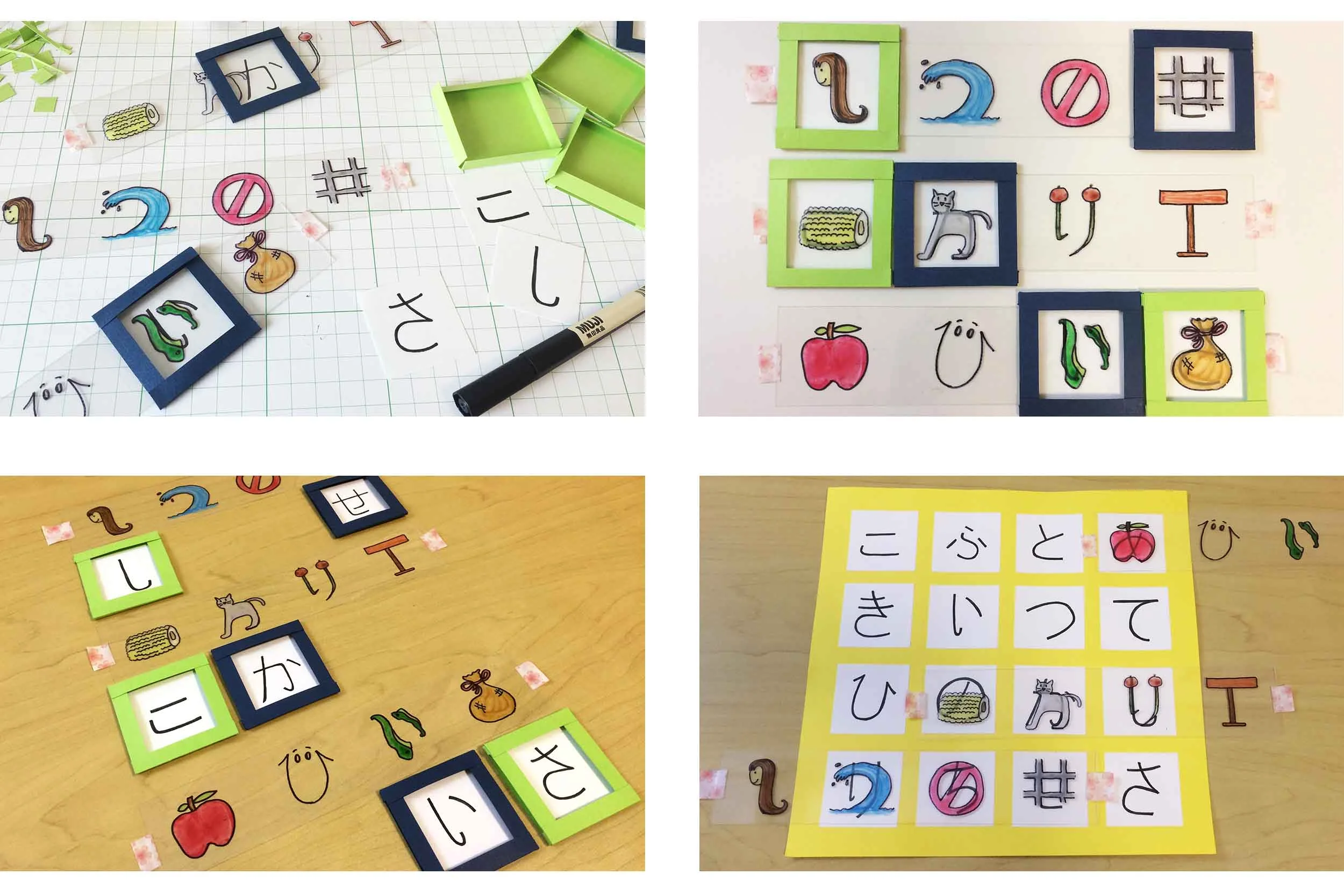
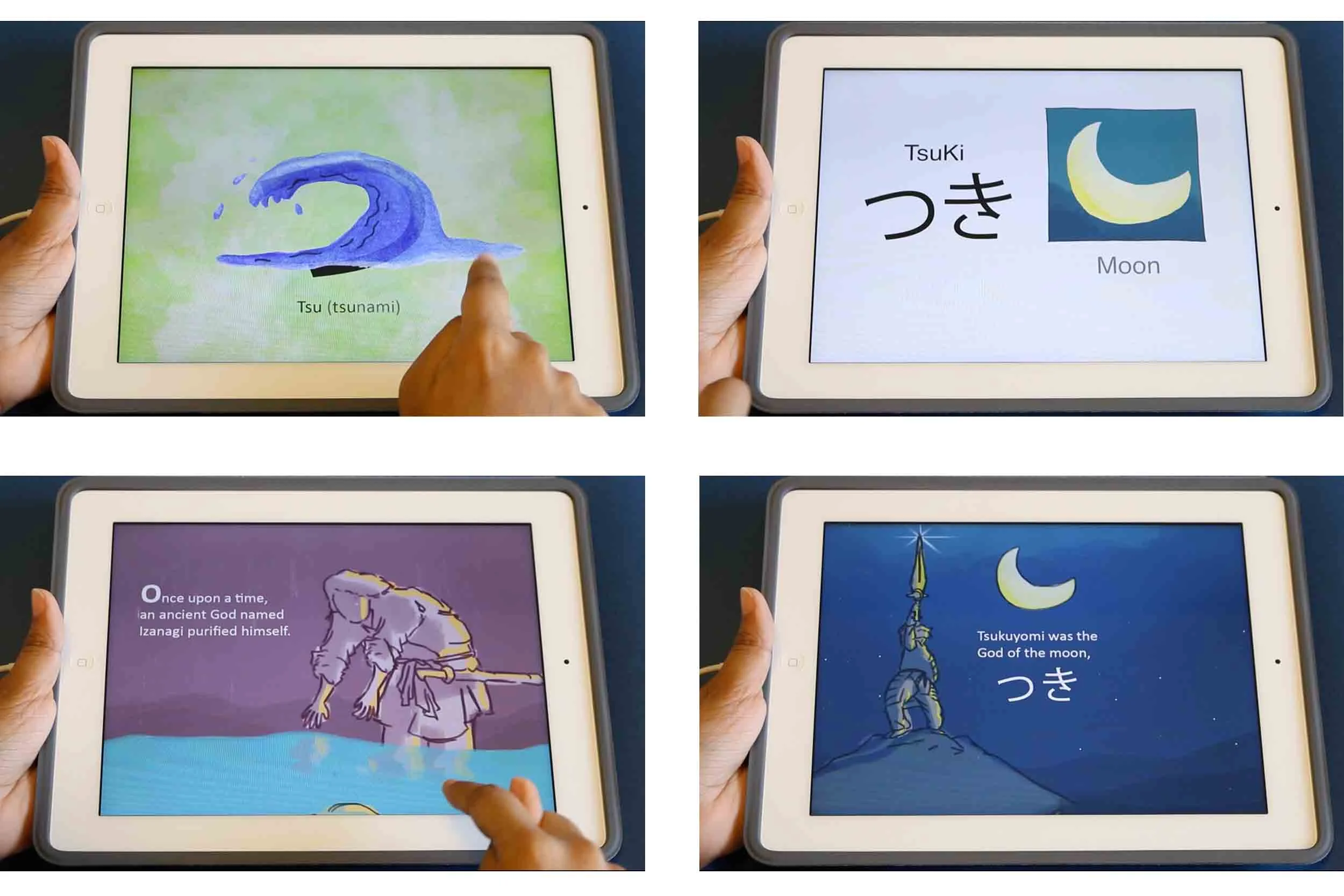
Focussing on one script- Hiragana, I created a simple paper prototype to quickly validate my idea and test different interactions for the user. I found the action of sliding the right image on top of a character seemed to work best for the testers.
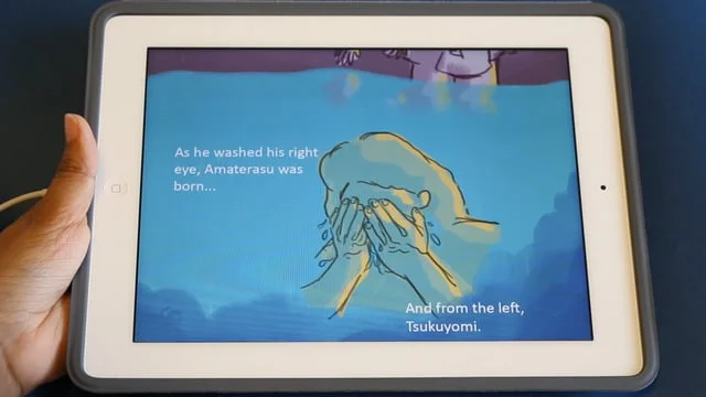
To grow this idea further, I made a simple game mechanism for the users to retain their language learning while discovering stories from a new culture.
This not only made the experience more enjoyable, but also ensured repeatability.
The key interaction: overlaying the right image over text.
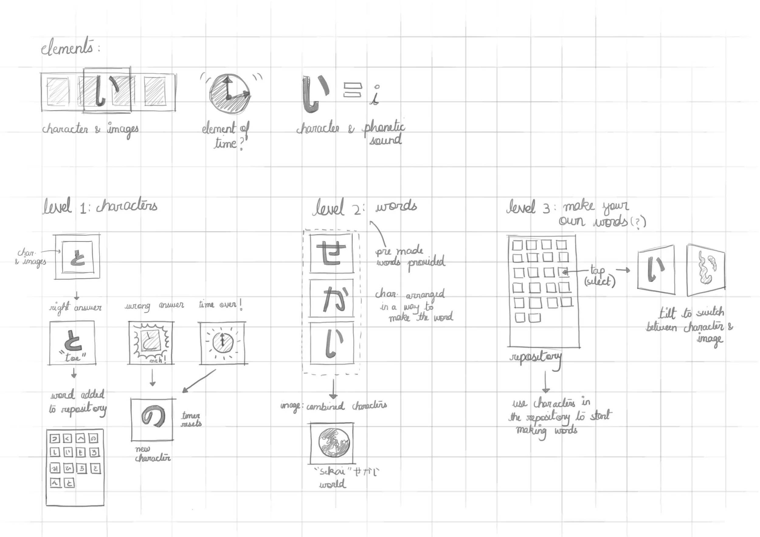
Different levels in the game.
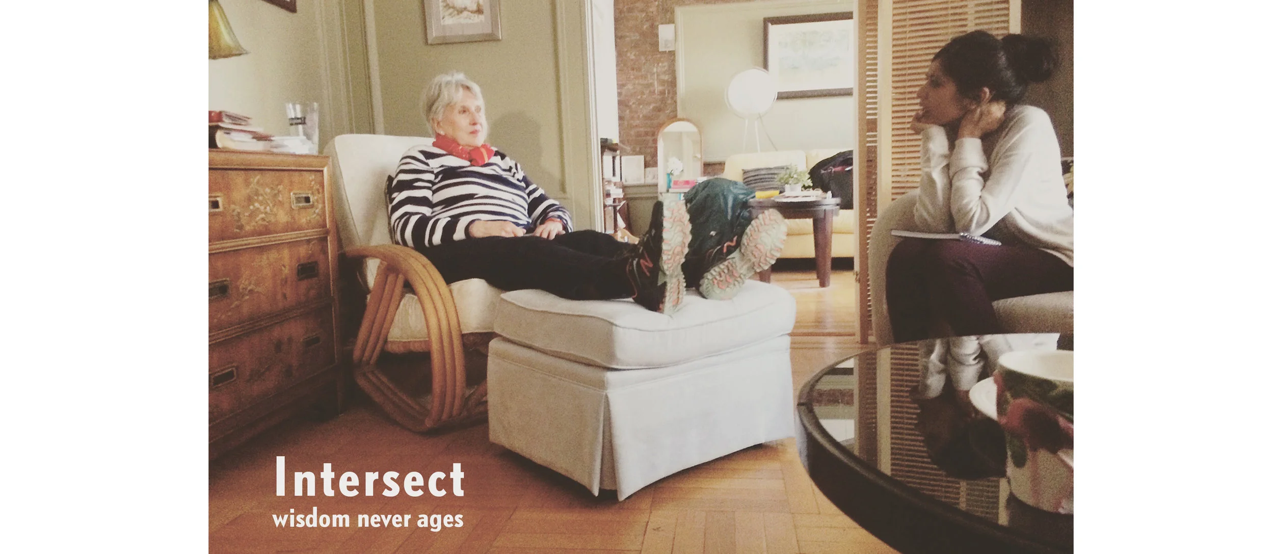
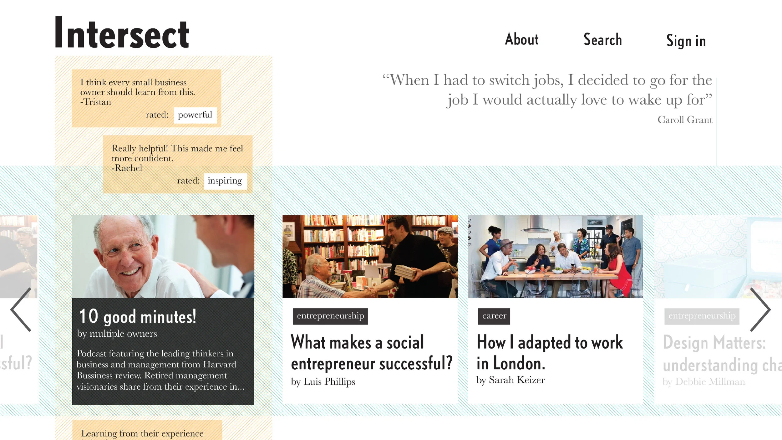
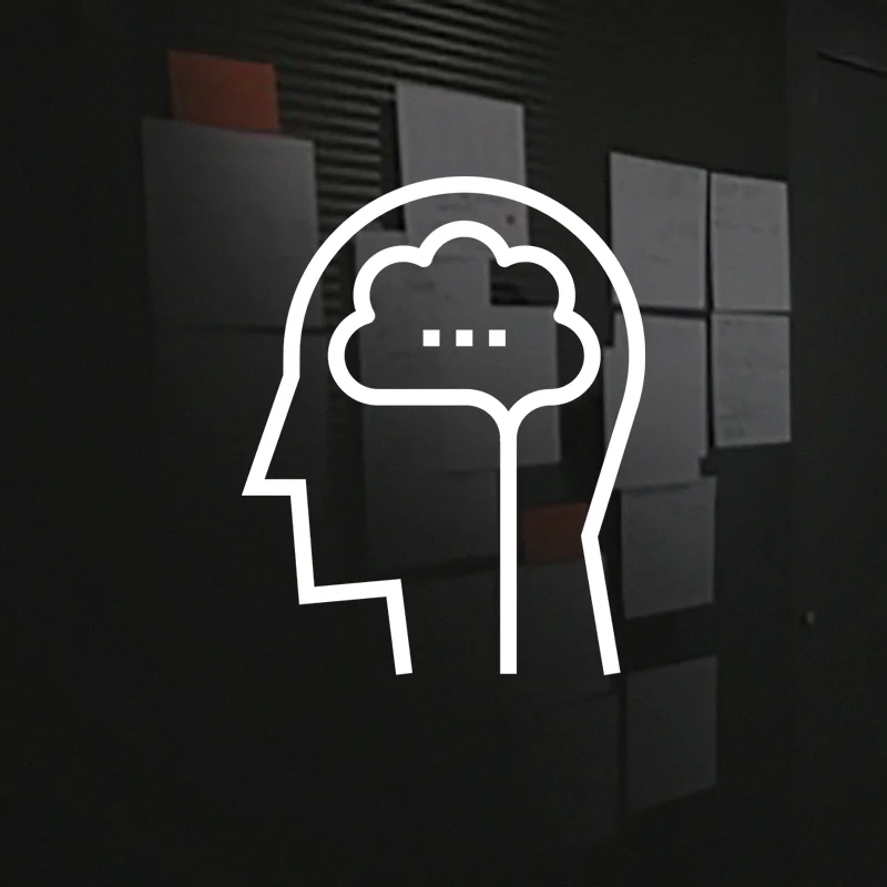
Helping social isolation in the elderly by imparting a sense of purpose.
During our research for the project brief "design for our future self" in New York, our team team decided to focus on social isolation in the elderly by providing them with a sense of purpose.
A sense of purpose is intricately linked to our professional & personal relationships which reduce with age. To address this, we created a web platform- Intersect.
The design represents the intersection between the elderly with their professional wisdom & the younger generation with their feedback.
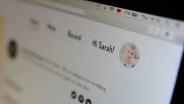
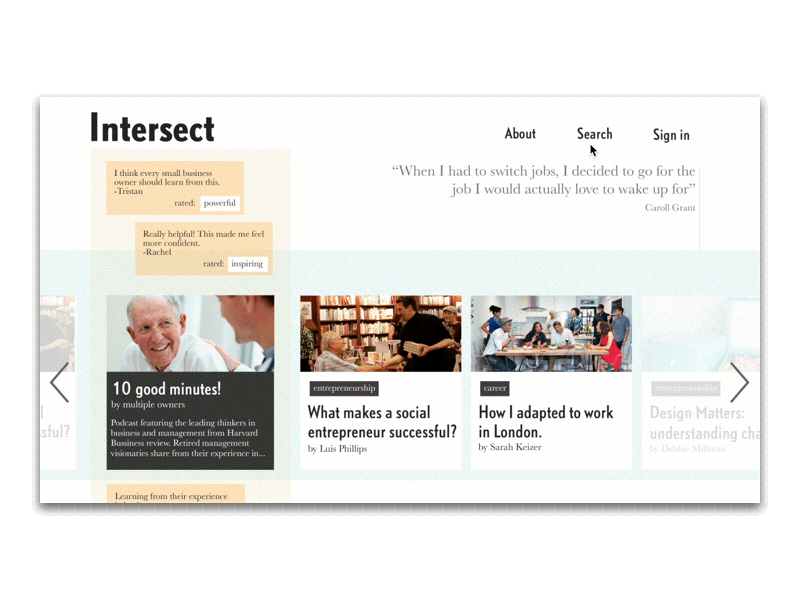
The main workflow- search & comment for the subscriber.
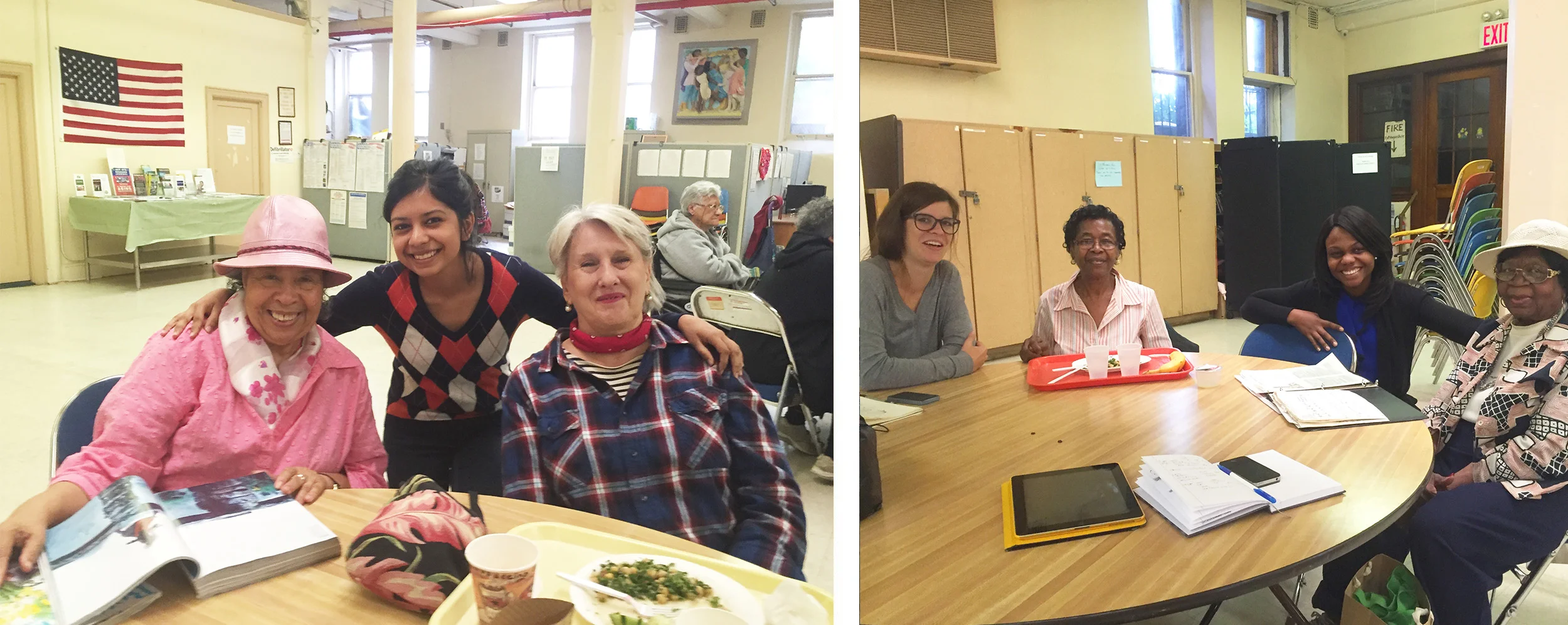
Initial research at Park Slope senior centre, NY.